 |
| Mandala this is a square design that I created with a yellow and blue color scheme. This was done with color pencils with the help of Roman Murray. The parts that are a little rough were done by him;) |
Thursday, May 18, 2017
Black and Blue Masquerade

Friday, April 28, 2017
Tree
 |
| Paper Mache This is a sculpture of a tree. Originally, it was supposed to be a regular tree with a character on it, but I realized that someone else was doing the same character. I, then, decided to just do a tree with a face on it. The biggest challenge I faced in this project was Roman's harsh criticism. |
Thursday, March 23, 2017


Tuesday, March 14, 2017
Eiffel
 |
| Bas Relief This piece is inspired by Roman Murray,so he says... The only "inspired" aspect compared to Roman's bas relief is the moon, but this piece was actually inspired by Robert Delaunay's Champs de Mars: The Red Tower. His painting of the Eiffel tower was rustic and had excessive lines. |
Thursday, February 16, 2017
Peace
 |
| Metal Tooling This piece shows two fish wrapping around a sun. The Japanese hiragana in the middle means love. |
Thursday, February 2, 2017
Plaster sculpture


Friday, January 20, 2017
Art Critique- Maya Laws
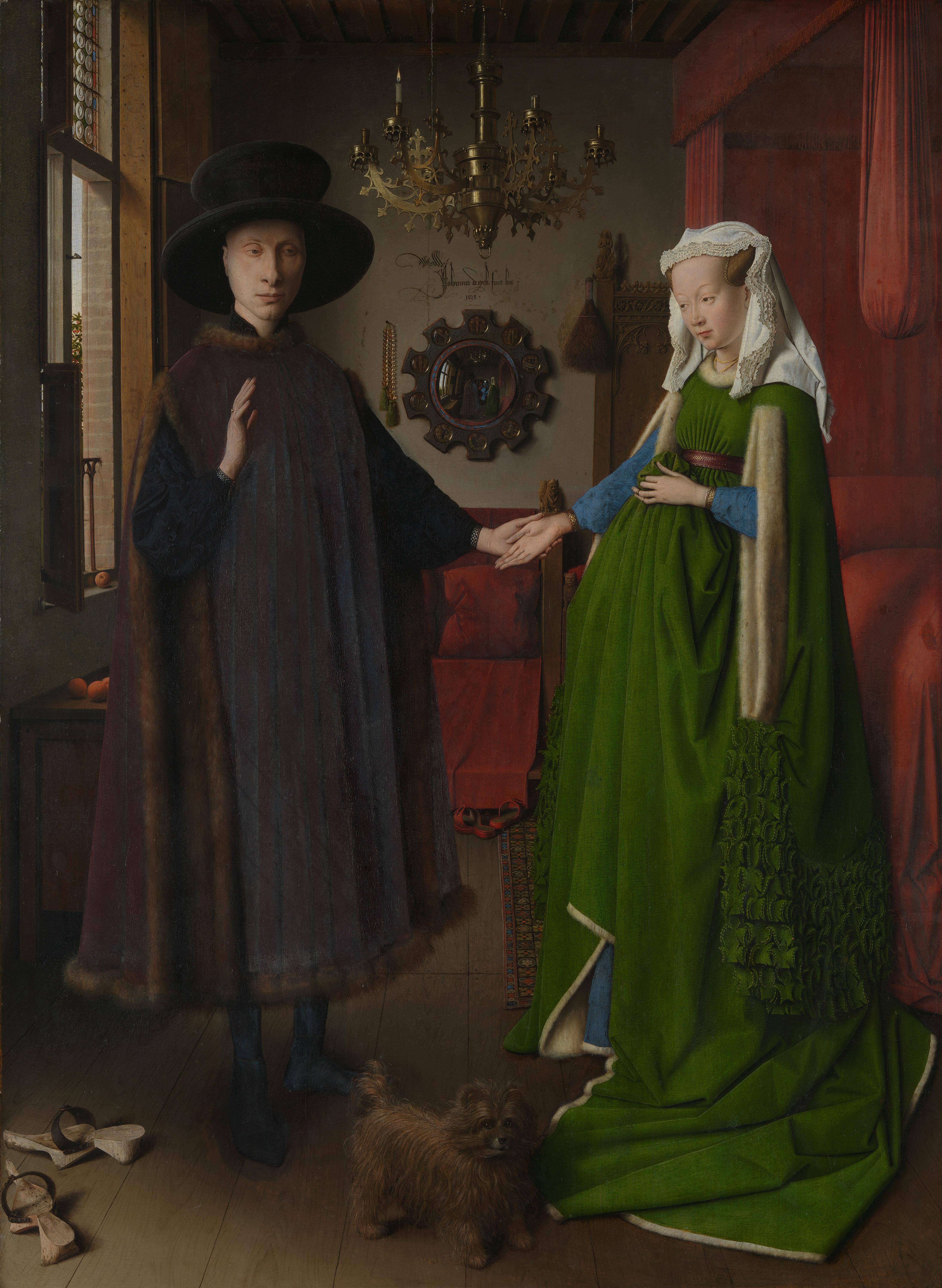
This painting is called “Arnolfini Portrait” and the artist is Jan Van Eyck. It was done in 1434 during the Renaissance era. Jan Van Eyck used his canvas, a full length double portrait, and transformed it into an oil painting. This piece was well known for its use of space with the mirror in the background. Van Eyck’s name is signed on the back wall next to the mirror. There is a dog in front of the two people standing in the bedroom. The woman is suggested to be pregnant and the bed on the right side is red. If you zoom in, you can see Van Eyck in the mirror. The man is holding the woman’s hand while she is gazing at him. The woman’s hair is up and she is standing near the bed. On the other hand, the guy is standing near the window. There is only one candle on the chandelier hanging above the two people. Lastly, the crucifixion story of Christ is painted on the outer frame of the mirror.
As far
as proportions, the painting is balanced on both sides. The guy stands on one
half while the girl stands on the other. The color of the faces contrast in color
from the rest of the mood so that you focus on the emotional aspect. Showing
emotion in the face was big at the time because artists always wanted to show
skill. Jan Van Eyck used the mirror to show skill in making perspectives in one
perspective. There is a repeated use of red in the background and the woman’s
dress adds a very bright look that is also something to focus on. There is a
pattern in texture in the clothing and bed sheets.
The
artist is trying to convey love and relationships. The amount of red in this
painting creates the idea of love and resembles the virgin Mary’s choice of
color. The man and woman are probably married because the woman’s gaze isn’t
down. It’s almost eye level which meant that she was an equal to him. The dog in front of them means loyalty because
that’s what they were incorporated for back then. Something that was considered
attractive in the Renaissance era was being pregnant, so the lady held her
dress up to where it looked like she was pregnant. We don’t know if she was,
but Van Eyck was known for putting woman in his paintings that were suggestive.
The color of her dress means hope and her hair is up which suggests that she is
married. Married women wore their hair up instead of down like the non-married
women. There is also only one candle on the chandelier which could mean that it
was a part of a wedding tradition in consummating the marriage. All in all, the
message was to portray a loving couple that, most likely, commissioned Van Eyck
to do this for them.
This
piece is very well thought out and I can see how much effort the artist put
into creating this piece. I really like this piece just because the artist
seemed like he had fun with it. He even signed his name so that it read “Jan
Van Eyck was here”. Everything connected so that it was all just one piece and
not just a bunch of stuff lying on the ground. The craftsmanship is great and
very neat. I wouldn’t say that I’m moved by this art, but it definitely communicates
something to me. The “Arnolfini Portrait” is worth a lot, in my opinion, and it
proves to be very valuable.
Tuesday, January 10, 2017
dreams
 |
| Vision Board This is a 3-D vision board. I made this because I didn't want to do the typical collage of pictures. I also wanted something that fit my personality, so I went for a more organized look. |
Tuesday, December 13, 2016
Tribal girl
 |
Scratch board
This is scratch art of a random girl. I drew this because I like to draw faces and it was challenging to draw it on a black canvas.
|
Thursday, December 8, 2016
Portfolio by Me

 |
My Portfolio
This is one of my many portfolios. I based this portfolio on my involvement in the visual arts academy and my life outside of the arts.
|
The Flute Player
 |
Color Wheel
This painting is dedicated to a close friend of mine that plays the flute. She's a very colorful and beautiful person, so I thought this assignment was only fitting.
|
The Hands We Weren't Dealt
 |
Tempera Batik
This is my artistic metaphor for 9/11. The hand represents the building that collapsed after so many lives were taken just from the fall. I chose to draw this because this was a chaotic event that had a rustic and harsh feel to it.
|
Interp of The Old Guitarist by Pablo Picasso
 |
Portraying an Artwork
This is a drawing of The Old Guitarist by the great Pablo Picasso. I drew this because it was mellow and clearly had a story behind it.
|
Trapped: Night and Day
 |
One Point Perspective
This is an allusion and also a room drawn in one perspective. I drew this because I wanted something simple but intricate that could make you think. My use of crayons in this piece was a great way for me to reach outside my boundary of using pencils.
|
Boy-Girl
 |
7 color schemes
This is my interpretation of the types of color combinations. I executed this in this manner so that you can clearly see the difference between the warm and cool colors or how they mesh when put together.
|
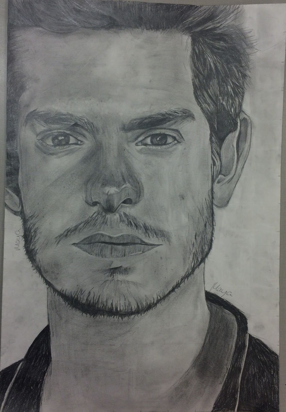
Andrew Garfield Portrait
 |
Value Graphed Portrait
This is a drawing of Andrew Garfield. I chose to draw him because I was looking for a challenge and drawing a man required me to explore different features rather than the typical female structure I am so prone to draw. |
Subscribe to:
Posts (Atom)